
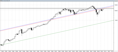
This is another version of the long term DJIA chart since 1900’s. I have revised the 70 year channel line into two lines. One of them assumes a higher connecting trend and the other assumes a lower connecting trend.
When combined with the horizontal resistance range of the year 2000 onward era it does seem to show that the DJIA advance, assuming it continues into year end, will be faced with all kinds of potential resistance obstacles.
The break into the 70 year long channel in 2008 was done very decisively and so it does seem to confirm a valid break inside the channel. Also the rejection during April 2010 of the underside of the channel seems to show quite a valid rejection. But now we are moving back up again to the underside of the channel.
During the mid 1970’s when the market rallied up in similar fashion to the way we are doing now, it then almost stopped cold and came to a complete stand still for at least 1 year of sideways small range horrible trading. Expecting the market to do exactly the same as occurred in mid 1970 is not a good idea. Still the 2000 year range resistance and 70 year resistance line does seem to suggest this may occur again.

All one can do is speculate that this may occur again. There is no way to get clarity on that scenario now. But if it does happen again then it would mean limited upside going forward ( between 500 to 1000 DJIA points ) and then a painful sideways churning that is not beneficial to bulls or bears, unless one does micro trading of the indices just capturing very small minor swings.
It may be a scenario to consider. I realize the more popular scenario is that a huge decline ensues taking DJIA much lower. But we have a current president who indicated in the past that they will put in place measures so that a recession of the severity we had in 2008 “can never happen again”. That kind of talk is highly inflationary. Politicians are not supposed to ban normal economic cycles.
If that ends up being a highly inflationary period perhaps only a few sectors will do well (gold stocks) and other businesses that can maintain pricing power.
thanks for your work and what seems “level headed” analysis. as you point out, it does not help the trader so much – – the time frames are too huge.
i was shocked at this wkends Barron’s. investor sentiment bullish indicator (Consensus Indx) actually fell last wk; from 63% the wk before to 56% (I had been hoping it would climb to 70%+), while the Aall Index did go from 42.5% to 49% this wk!
the 10 moving average of AD and Arms / Trin strongly suggests that we are very overbought and really due for some strong down days, strong being defined as days with declining strongly over advancing. But unfortunately, while we might get a couple such days, once the pressure is relieved we can go on another string of advancing days that can last a long time.
Welcome,
I can never seem to make sense out of sentiment surveys. I suppose the most extreme readings that occasionally occur are the best signals to watch out for.
Right now the moving average of put/call seems to say we are due for a drop, but the problem is sometimes the readings can push to extreme overbought.
It is starting to look like DJIA will tag the April 2010 high before the next real drop comes in.