
I don’t know why I got so obsessed with deflation. Inflation Deflation Disinflation, it is all just one big confusing mess to me. I think I can understand why they sometimes refer to the field of economics as the ‘dismal science’. It is such a complex science and the variables seem to change all the time and probably most economist predictions turn out to be wrong. Is it even fair to compare the economy of now to the economy of 1930’s? Isn’t that sort of like comparing apples and oranges?
I must admit I became really obsessed with the deflation scenario in recent months. Several months ago I had a pretty firm conviction that we were in a mid 1970’s type market environment. Now I am starting to open up my mind again to the mid 1970’s scenario time frame and throwing the deflationary depression scenario into the garbage can. I am not fully switched over but I probably will be soon. It will depend on certain levels being reached and the overall character of the market action in the days and weeks ahead.
I think it is safe to say that the elliottwave folks are in the deflationary depression scenario looking for much lower prices perhaps in the DJIA 1000 range into the next 6 years I believe. It is also somewhat widely known that there has been a comparison made between the 1929 crash, then the 1930’s rally and then the follow through collapse into 1931 and beyond.
No disrespect meant to the elliottwave folks (they have a lot of clout and probabyl a HUGE subscriber base that influences a lot of trading bloggers and other market participants) but I am really starting to wonder right now if it is even a valid comparison to make between the early 1920’s run up to 1929 and then the 3 year collapse into 1933. I really do not think it is and is maybe a misguided approach and invalid. Be very careful about getting married to a deflationary death spiral scenario where you feel that market must break the March 2009 lows and cascade down as was the case in 1930 to 1933. For those who like to trade, it is very important to keep a flexible open mind on longer term market direction. Often times it is the very subtle hints and clues that determine the ultimate longer term direction of the market. I mean why can’t we just stay in a disinflationary period instead of a deflationary death spiral ? Seems possible to me.
We have been in an enormous sideways trading range since the year 2000. So basically we have been in an almost 10 year bear market already. From the year 2000 to the year 2007 we did not go straight up in persistent fashion as was the case between 1922 to 1929.
So the entire context of our current market is very different than that time frame. If I had to make a comparison to a previous market structure then the 1967 to 1975 market periods seems much more valid to me because it was a similar sideways bear market with an enormous trading range with an in between huge 2 year bear market decline into 1975.
The decline from 1972 to late 1974 had a similar structure in terms of time and pattern and depth. It was also similar in that the final swing lows during September 1974 slightly pierced early 1970’s support but then closed back inside the range.

Unfortunately the time scaling in the two time periods is not correct but you can still get the basic idea of what I am talking about. You can see the 10 year bear market duration. Then the recent 2 month correction and in the case of the mid 1975 period a new rally that went almost back up to the all time highs!
The decline in the sp500 that started at end of April 2010 so far has lasted about maybe 2 to 2 and 1/2 months and it has been at a total depth of 14.6% from the intraday highs in April 2010 to the intraday lows in June 2010 and also a .382 retracement.
The corrective decline that began in July of 1975 and ended in September of 1975 had a total depth of 15.5% and was close to a .382 retracement of the previous rally.

The chart above pretty clearly shows the possible dynamics of what is going on here. This seems like a much more valid comparison than any 1930’s scenario. I am not saying that the economic factors are similar to 1975, just the chart structures and the current turning points.
I forgot to draw in the 50 day moving average and the 200 day moving average in the chart above but they show a similar stance in both time frames. And it is interesting to note that in 1975 the 50 day moving average was moving down at a very rapid pace almost certain to cross the 200 day moving average on the downside but it only briefly touched it and then SHOT UP LIKE A ROCKET and completely evaded a bearish death cross. The only way it was able to evade the death cross was through a very rapid and steep price advance that wasted no time.
In the current time frame of 2010 we already know that the 50 day moving average has officially crossed the 200 day moving average giving a confirmed cross. The market can still change the configuration of the two moving averages by doing exactly what happened in the 1975 period – a steep and persistent rally the recovered a lot of lost ground FAST.
Everything I just wrote in this post is still on the condition that we do not break down below the recent lows and go deeper past a .382 retracement.
Finally here is the super long term QUARTERLY candlestick chart of the sp500. Note that the April 2010 highs where the sp500 stopped was consistent with resistance ranges and the recent decline stopped consistent with supportive ranges particularly back to the 1998 period.

The key thing about this long term chart is the MACD histogram which is still showing a rising slope and that the current market wants to trade higher after the recent 2 to 3 month consolidation.
Clearly the quarterly price chart is extremely long term and is like a massive oil tanker. It is very hard to change its direction once a certain amount of momentum is achieved. It is at least potentially a very important massive bull market signal. But even if I am correct and we do trade back up to 1400 to 1500 range, I still feel that market will fail there from heavy resistance and succumb to another bearish quarterly triple M signal.
The quarterly MACD is starting to curl up may lead to an eventual bullish cross just as was the case in the mid 1970’s quarterly MACD.
And finally one last important point. The Quarterly MACD crossed to the downside on June 30th, 1930 and crossed to the upside on December 31st, 1934. This is just one more reason why the comparison is most likely invalid to the 1930’s scenario.
In the Near Term
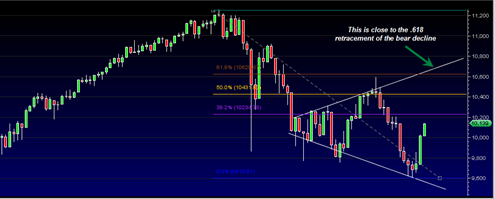
What may happen in the near term is a bullish move to the .618 retracement of the entire bear decline. This is what happened in the recovery rally of the 1975 period and would put us in terms of the DJIA near the 10600 to 10700 range which would also correlate to the top of the expanding triangle formation. It could be quite a persistent rally up to that point given the current apparent bullish divergence.

I repeat… be very careful about assuming that stock prices must go down into a spiral as was the case in the 1930’s ! The correlations do not seem to match time wise. Those who are talking about a total collapse below the March lows and 30% unemployment etc. etc. should seriously consider comparing the 1970’s period as an alternative.
A flexible open mind is key!