

The gold price has accomplished a feat so huge that it may never ever be seen or repeated again for at least half a century or more. So if you are reading this, pay attention because you will probably never see a pattern like this again in your life time. The gold price has formed a cup and handle chart of massive proportions.
I was tipped off about this pattern by a friend of mine name Roland. Thank you Roland for this outstanding observation! Sometimes the most obvious patterns have a way of hiding from you, maybe because some of them are so slow to develop.
The pattern is called a cup and handle for obvious reasons, it looks like a tea cup with a small handle. This is not the rarest of patterns but still popular and was made very popular by William J O’Neil and his Investors Business Daily investing publication. The cup is a large rounding bottom type formation and the handle forms near the old highs and represents residual selling that precedes a breakout to new highs or new all time highs. In the case of the gold price we are looking for new all time highs.
This beast of a pattern is…
A Massive Twenty Nine Years Long !
The entire pattern is 29 years long. So that means I was 10 years old when the cup portion of this pattern started forming. So I would have had to observe the gold price at age 10 and then wait and watch it form the cup for about 28 years and change. 28 years and change! That is a long time to wait for a pattern to develop!
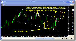
You can see that the handle is the formation that has been developing since March of 2008. There is a zoom in portion on the chart above where you can see the handle in more detail.
It is notable that the most recent monthly close was near the top of the price bar. In addition the most recent quarterly price bar for 2008 was also near the top of the range. This bodes well for both the first month of 2009 (January) and also probably the first quarter of 2009. Combine that with the seasonal tendency for gold to be strong during January and February and you have the makings of a potentially huge move.
Indeed, in order for this pattern to be confirmed we need to see a breakout north out of the pattern.
Thomas N. Bulkowski’s statistical research on cup and handle patterns shows that 50% of them meet their price objective. In the chart above the calculated price target based on the 50% success rate equates to a 1423 gold price. If the pattern is fully successful then it could imply an 1813 gold price. Either way you look at it, gold looks like it wants to move much higher.
If you look at the little demo charts of some sample cup and handle pattern’s on Bulkowski’s site you can see that the breakout portion of the move is typically a sustained rapid move with running price and good follow through. In other words for the breakout to be valid we want to see a sign of strength in terms of price. So that means what we should see in the first 3 months of 2009 is a fast price movement that zooms up to the highs and then never looks back.

The chart to the left is once again the actual gold price as of 01/02/2009. What is interesting is once again there appears to be a smaller cup and handle pattern that seems to be saying gold wants to breakout. The measurement target of this smaller pattern is roughly 1040 gold.
This means that if this smaller pattern is valid, we should see in early January a fairly fast and swift move back up to the old all time highs in the gold price.
But wait there is more.
 Here again is the more recent action of the gold price as represented by the GLD gold ETF. You can see that the pattern has the look of a large flag pattern. And you can see the smaller cup and handle near the end of the flag.
So if this smaller cup and handle gets a breakout, it means that price will be above that white downtrendline on the flag. So by definition that would say the breakout is in effect.
So we essentially have a very large cup and handle pattern of 29 years in length. But then we have a smaller cup and handle pattern within the very large handle of the whole 29 year pattern. Does that makes sense?
Certainly the gold market does not have a reputation for making things easy. So as bullish as all the above charts look, I am still a little bit weary it will play out exactly like this. We cannot rule out one more violent shakeout to the downside before things start cooking.
Markets seem to have a habit of doing that. Shaking the tree as much as possible before the big move.
Lets see what happens.
A cup and handke pattern cannot exist over that time period. the reason is very simple. Chart patterns are the effect of the psychology of buyers vs. sellers. Because the buyers and sellers of 2009 have no connection to the buyers and sellers of 1980, then that means there is no psychological connection either. That is to say, there are no buyers or sellers of gold today who were buyers or sellers in 1980. No connection means this is not a 29 year old pattern. It is you trying to see somethig that isn’t there. This is not to say that prices are not going higher, but they are not going higher for the reason you are suggesting.
Thanks for the comment Kevin. I agree with you in part. But I still think that technical analysis patterns work on all time frames no matter how large. And I do think there is still a big psychological connection to the peak in the gold price that was reached way back in 1980. One has to ask why did prices stop and consolidate around the level of the 1980 high… was it pure coincidence? I think no. I think it was because a lot of the people who are trading gold futures now remember what gold did back then and felt it was a good time to sell since we were hitting those levels again. Isn’t that psychological ? I understand what you are saying though that is is extremely unlikely that there are still people from 1980 still holding onto positions. But I think a lot of people sell when price comes into previous price areas just for technical reasons and that keeps building technically valid patterns in my opinion. But I see your points.
I agree with the author and the reason the psychological connection is established is because the market will always always always look to the past price action of a stock,commodity etc.. even back to thirty years. What the traders today have in common with those thirty years ago is that they look at charts!!!!! you betcha they will definitely look at past price action and in this case it takes a thirty year chart to find comparable price action to what we are seeing today. case in point right now is a 4.5 year old cup and handle on SCLN..