
I started to get really tired of people talking about the inflation rate lately with endless guesses about what inflation might or might not do so I decided to take matters into my own hands. I just plotted the MACD and MACD histogram indicator against the monthly inflation rate going all the way back to 1914.
From the chart I was able to make a few interesting observations. First if we exclude the dramatic disinflation of the 2008 to 2009 period it looks quite clear that the inflation rate has not done anything really exciting going all the way back to 1992 relative to what was occurring before that time frame. Second, from the monthly plot of the inflation rate I notice that we have initiated an MACD histogram potential buy signal which would be confirmed if the inflation rate ticks up again on the next monthly reading.
The quarterly price plot of the inflation rate is telling me that we are on the verge of an upside MACD quarterly histogram breakout which should carry the inflation rate higher for the duration of 2011 and probably also into most of 2012.
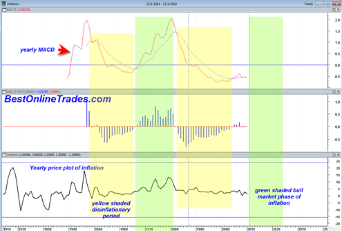
The YEARLY plot of the MACD against the yearly inflation rate shows that the yearly MACD of the inflation rate is bottoming out and that if we can get an inflation rate surge higher in 2011 and 2012 it would very likely initiate at LEAST a 10 to 15 year bull market in the inflation rate similar to the 1970 to 1980 period.


What is amazing about the yearly price chart of the inflation rate is that it basically shows that we have not even come close to starting the 10 to 15 year bull market in inflation.
But the yearly chart does show to me that we are on the verge (from a very long term perspective) of a big up cycle in greater inflation. If 2011 is a big up year for inflation, then it will have put in an MACD histogram potential buy signal going into 2012.
Note the configuration of the yearly MACD of the inflation rate before the decade of the 1970s and how in the late 1960’s a yearly MACD buy signal was generated which led to all the chaos of the decade of the 1970’s.
So what the yearly inflation rate chart is telling me is that we are going to have more MASSIVE swing trading range markets in both the up and down direction.
Clearly the charts above are extremely long term, but they DO help to take all the guess work and doubt about what is coming during the next decade.
The common belief is that the government reported inflation stats are manipulated and not accurate. This appears clear when you make a simple trip to the grocery store. And then we see these mass uprisings in Egypt. I wonder why?
It seems as though at some point during the next decade America will have its own mass uprising as they get sick of rising or even skyrocketing inflation rates. You just have to look at the long term charts above to see this clearly.
The issue is at what point does rising inflation transfer from ‘prosperity inflation’ to ‘liability inflation’. I don’t have an answer to that question, but I suspect part of the answer will be related to the rate of increase in inflation.
“..MASSIVE swing trading range markets in both the up and down direction..”
Can you pl elaborate on how you are co-relating the inflation upswing to equity market swings?
Marc Faber the swiss economist indicated in the past that strong inflationary periods in markets can lead to wild exaggerated swings in the market indices over time. So I am borrowing his assertion. Just as an example, currently we are in an up swinging ‘pro inflationary’ type rally in the market with the Fed at the steering wheel. But if they overshoot their stimulus then the ‘good inflation’ may turn into ‘bad inflation’ in that it is starting to accelerate or even move beyond control. That would likely eventually swing the market back down south as out of control inflation would be like a heavy extra tax on everything.
We have already been in a massive swing trading range since the year 2000, so it is not too far a stretch to presume that this may continue within this large range. It all depends on whether the inflation rate is able to accelerate fast enough into the end of this year and next.
It looks like inflation is already beginning to go parabolic
Forgot this
http://www.apartofny.com/a-daily-anticipatory-cpi/
Very interesting, it sure does. Or a simple trip to the grocery store reveals the same. Plus, I noticed that most gas stations now use digital price displays so that they can update prices faster. Seems to be an early sign of the psychology of not being able to keep up with price increases.