
The 8.6 year global cycle model of Marty Armstrong nailed almost perfectly the exact top in the IYR real estate index in February 2007. The exact date was February 25th, 2007. I find it quite fascinating that his 8.6 year cycle model nailed the exact turn in the real estate market and yet it appears he gets no credit for it in mainstream media. That cycle date of 2/25/2007 was in existence decades ahead of time and there was more than enough time to prepare for it. And yet it happened anyway? It just goes to show that no matter how much the powers that be try to manipulate and fine tune the economy, ultimately they will succumb to larger cyclical forces and sometimes succumb to them within one week of precision.
We can look at the 2/25/2007 turning point date and also look at the IYR real estate ETF weekly, monthly and quarterly candlestick charts to see how this top developed.
Cycle models such as the one created by Marty to me are like a little ‘cheat sheet’ on the world economy and markets. I have to tell you honestly when I look at his cycle model this overwhelming sense of total awe and amazement hits me. It just makes me realize how clueless most of mainstream society is. Here we have this global cycle model that has pinpointed major turns in economy and politics, and yet at the same time we all just continue to go about our lives as if we are controlling the ship. But something else seems to be controlling it. The Fed could have printed 20 trillion dollars near 2/25/2007 but it probably would not have stopped the total collapse that occurred during the following two years. This is why I am so amazed now at how much people seem to think the Fed has the market under its total control with POMO and other tools. We shall see how much control they really have when we get to the next 8.6 year cycle model turning point of June 14th, 2011.
Still, one cannot use Marty’s turn dates blindly. I have to combine them with my own work, indicators, candlesticks and other criteria for more clarity.
Lets take a quick look at the 2/25/2007 turning point date in the IYR. I really think the weekly, monthly and quarterly candlestick price charts are the best ones to focus on for 8.6 year cycle turn point dates. After all we are talking about 8.6 YEARS, not days. So we need to give the market some free play and not expect a market to turn like a light switch.

The chart above shows the monthly candlestick chart of the IYR, then the weekly candlestick chart and then the quarterly candlestick chart.
The monthly shows that there was a significant topping tail on the month of February and was the first monthly topping tail of that size in YEARS. Also on the monthly we see that the MACD histogram had ticked down and monthly RSI had double topped. Monthly MACD was not anywhere near a bearish crossover however which is consistent with MACD being a lagging indicator. Price is the best leading indicator.
The weekly portion of the IYR real estate ETF above shows again that there was a very significant weekly shooting star candlestick, also a tick down in MACD histogram and weekly RSI moving towards a bearish cross under the 70 percentile line. Weekly MACD moved into a bearish crossover near the 2/25/2007 date.
The quarterly candlestick chart is the most powerful from a longer term basis in that it showed a HUGE quarterly shooting star reversal candlestick that had dramatic implications for more LONG TERM downside.
So the study of the IYR real estate ETF in conjunction with the 2/25/2007 Marty Armstrong 8.6 year global turning point date shows how one can combine the two to try to identify a turn in a particular market.
It is possible that the 6/14/2011 8.6 year turning point date will mark a turn date for government finances for the worse. In other words it could mark a point at which the finances of USA states begin to head into a death spiral. Of course this is just a little bit of healthy speculation on my part. I really do not know what will turn on the 6/14/2011 or even if it will mark any significant turns. There still exists the risk that it won’t mark a turn date in anything.
What I have found is that the turn dates can be more effective if we see markets moving up in very strong fashion into the date or moving down in very strong fashion into a turning point date.
A month or a few weeks before the 6/14/2011 8.6 year cycle date I will plot here at BestOnlineTrades the weekly, monthly and quarterly charts of the following ETFS:
- GLD
- IYR
- SPY
- TLT
- USO
- IWM
- XLF
- SMH
That should be a broad enough spectrum of ETFS to look at to see if we will get a successful major turning point in any or those ETFS.
The fact is though that right now we are seeing the quarterly MACD in major bull market mode on most indices. So with the 6/14/2011 turning point date only a few months away, my sense is that if we do get a turn in any of the above markets it may only be a temporary set back instead of a major multi year type top. That is just some more speculation on my part for now, but we will have to see how things look as we get more price date moving into that date and then beyond.

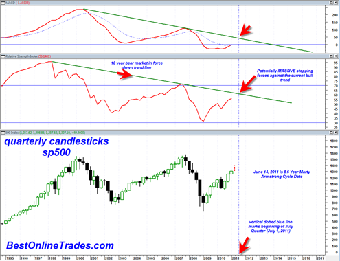
I will still say however that the above chart is probably one of the most important charts for longer term timing purposes. And the chart does seem to fit very well with the mid June 2011 Marty 8.6 year turning point date.
The June 14, 2011 turning point date is basically the end of the second quarter. So we are still working on the current quarter and so far it is still moving upwards.
But note very carefully the solid green lines in the chart above. They are drawn in to show the down trend in the RSI and MACD on the quarterly time frame since the markets topped out in 1998. These solid green down trend lines especially on the RSI shows that the bear trend is still in force and that if and when the quarterly RSI line moves right up under this line again or even touches it, it is very likely going to be REJECTED. This means that the market could be moving into a huge top by mid June 2011. By mid June 2011 we will have two more quarterly candlestick bars which should be enough to move the quarterly RSI right back under the 10 year bear market down trend line. This is very significant and makes the mid June 2011 turn date that much more interesting as it fits so nicely within the confines of the chart above.
That long green down trending solid line on the quarterly RSI is the ultimate of ultimate battle lines in my opinion that will determine whether the market starts to turn bearish again OR somehow manages to bust out north and see much longer term blue skies again. I tend to believe the former case is much more probable for now.
Doesn’t Marty think Dow is going to 20,000?
Yes I believe so… but I still think it will have some trouble before that on the quarterly chart. That quarterly RSI resistance is no small task to break through… so question is does it eventually break through or not.. we will just have to wait and see…