
One of the longest most slowly moving price charts is the quarterly price chart. It is always a good idea to review this chart after every quarter or two to be sure one is correct on the markets longer term intentions.
The quarterly chart is akin to a large oil tanker. Once it has started cruising in a given direction it is very unlikely going to change that direction unless acted upon by a very significant force. The current ‘action’ that appears to be driving the market is the easy monetary policy and this does not seem ready to dramatically change any time soon.
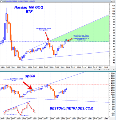
The current factual state of the markets are that we have a bullish quarterly MACD Crossover. This crossover is in an early state of crossover which basically means that the bullish trend implied by this crossover is just beginning. In addition the quarterly MACD signal line is just now in the process of crossing above the zero line, another longer term bullish sign.
The last time the quarterly MACD had a bullish crossover was in late 2004. That led to generally rising prices for almost 3 full years in the sp500. It could very well be that the most recent quarterly bullish crossover will also lead to rising stock market prices for 1 to 3 years or maybe more. The current ‘news’ does not seem to support this idea, but relying on news for market direction was never a good idea anyway.

In addition to the bullish quarterly MACD crossover, we can also see from the chart above that the sp500 and the QQQ appear to be trading in very large broadening wedge formations. It seems to suggest that the QQQ will only be stopped upon arriving at the top boundary line of its broadening wedge. The sp500 is significantly lagging the QQQ and has not even made it to the 2007 highs yet, so at this time it is unknown whether the sp500 can make it to the top boundary line.
It is possible that we could see the QQQ index trade to the top boundary line and at the same time see the sp500 meet the 2007 highs. That could be a recipe for some type of new trend down again.
Previously I had a theory that eventually the advance in the sp500 would be halted before the 2007 highs because of a heavy dose of inflation stopping upward progress. But now I am not quite so sure.
The QQQ has already busted above the 2007 highs trading a full quarterly price bar above and doing a successful retest of the 2007 highs as well. So now the QQQ are likely to trade higher again (on the very important condition that the 54 level holds). So the QQQ is trading in the ‘green zone’.
Shorting the market is likely for a long time only going to be a ‘shot gun’ type of shorting opportunity as we saw in the most recent ‘Japan Earthquake’ correction. The market corrected but then shot right back up to the old highs. That is a very dangerous type of market to short. The better bias likely will remain for quite some time one of ‘buying the dips’.
But it could be that inflation at some point starts to suck the life out of the stock market and either halts the advance or slows it down significantly.
I would look towards the 6/13/2011 Marty Armstrong Cycle turning point as a possible pause point to see if the market starts to change character around that date.
But in the meantime, the trend appears clearly up, although sometimes cumbersome…