
Trader’s worldwide need to pay attention to this important pattern developing in the major indices.
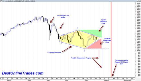
Both the sp500 and the SPDR S&P 500 ETF as well as a few other indices have as of today completed the formation of a quite large diamond chart pattern. This is without a doubt one of the most disgusting technical analysis patterns in existence because of its ability to confuse both bears and bulls and basically keep them in a washing machine whipsawing them all over the place.
It is also extremely difficult to spot early on. I wish I had known ahead of time that this pattern was about to form as it would have made things a bit easier.
So the situation right now is that the sp500 is near the apex of this pattern and soon a result will come out of the pattern either bearish or bullish. This diamond pattern can either be a continuation pattern or a reversal pattern. If it is a continuation pattern then we would expect a similar somewhat straight line move down out of the pattern similar to the straight line move that lead to the construction of the pattern (the end of April to May 6th price move). This would activate if we get into the red shaded area on the chart below.
If it is a reversal pattern then we should see a topside breakout out of the pattern into the green shaded area.

The downside measurement projection of the pattern is 950 or 890 depending on how the measurement rule is calculated. I get the 890 measurement projection based on measuring between points A and B and then projecting down from the horizontal blue dotted line. The 950 measurement is calculated by measuring one of the straight line moves that lead into the pattern and then projecting from the center line apex of the pattern down.
According to Technical Analysis of Stock Trends by Edwards and Magee (perhaps one of the best reference books on technical analysis available, truly the ‘traders bible’) the diamond pattern:
“might be described either as a more or less complex Head and Shoulders with a V shaped neckline…it’s natural habitat is major tops and the high volume tops which precede extensive intermediate reactions”
If you look at the diamond price chart in this post you can see that I also have drawn in three dotted red ‘hats’ to show the head and shoulders formation and then the V shaped neckline.
The problem is that if you look at the price action within this diamond one could also say that an inverse head and shoulders pattern (not drawn in chart above) is also developing at the same time.
We could just as easily see an upside break out from this pattern as we could see a downside breakout.
In Which Direction will the Diamond Break Out?
In the daily time frame the MACD histogram triple M sell has still not confirmed a sell signal with the last 3 days action despite today’s big drop. To confirm the MACD histogram sell signal we need a close below 1063.32
The MACD is starting to curl over for a bearish cross, but the MACD histogram has not quite confirmed it yet. A bearish confirmation either tomorrow or Friday of this week would go a very long way towards ‘kick starting’ a new bear phase out of this large pattern.
A large break upwards topside out of this pattern would heavily strengthen the bull case because it would also coincide with a topside breakout of downtrendline resistance as seen from this chart of the sp500.
The McClellan summation index of the sp500 ticked upwards again today above the zero line and seems to contradict the possible bearish momentum into end of this week. Sometimes the McClellan summation index can have a lag factor of several days. A very hard down day of 2 to 3% during the next two days would help to turn the summation down again. But so far it is still trending up and somewhat of a concern for the bearish case.
We are still about 15 trading days from the important August 11 cycle date. The size of the diamond pattern tells us that it has by definition a lot of cause or energy that has been built up for a big move.
The pattern suggests that we are on the verge of a big 15 day move.
The problem is that this pattern can be interpreted as being both a complex head and shoulders bottom formation or a head and shoulders top formation.
If I focus on the MACD alone and see that it has now for a second time failed to break above the zero line and is now also starting to curl over downwards (although still unconfirmed by the MACD histogram as a sell) then it sways me to a bearish break down out of this pattern.
But I have to admit that the other thing that is bothering me with the bear case is the volume pattern on the SPDR S&P 500 ETF. The volume pattern on the dates of May 6, May 20th, July 1st, and most recently July 16 had volumes of 647 million, 530 million, 382 million, and 282 million respectively. Those volumes that correspond to those dates were at important swing points near ‘V’ bottom points in the market since this whole decline phase began.
The ramp down in volume can be interpreted two ways. First that it is a gradual decline in sellers since the whole decline began end of April 2010, or that it is a contraction of volume within a large descending triangle that began end of April 2010 and will now lead to a breakdown out of the descending triangle and lead to a surge in new volume.
So my gut feel at this point is that we get a breakdown and start to trade in the red shaded area on the chart above. This gut feel will turn into a ‘confirmed gut feeling’ if we get a close in the sp500 under 1063.32
But if we get a break up into the green shaded area, then lookout above as it could lead to a move to 1170.
The diamond pattern can be a reversal or continuation pattern and represents a lot of market cause being built up for a new move. Let us hope that we get a verdict within the next 2 trading days.
Tom
I wonder why you have not drawn the diamond more symmetrical, i.e. the blue line over the pink section is at a steeper angle than the blue line under the green section?
Fundamentally, with Bernanke’s now famous characterization only today of the economy as “unusually uncertain” would seem to auger for a breakdown.
However, I am nervous about today’s decline and knowing that tomorrow we have Microsoft and Amazon earnings. If MSFT blows the roof off and announces a special dividend with their cash hoard, I think that would be a momentary boast to the market. Momentary.
My other / second question to you is: do you know in the past, has the exit from the diamond pattern ever gone for a couple days in the contrary direction than it ultimately went – – for example, is it possible to confound the bulls by breaking into the green for a couple days before rolling over HARD and descending into the pink. Sort of like a diver jumping up from the diving board before descending into the pool.
From a fundamental perspective, I think there is too much uncertainty in economy for a sustained move up.* Even Doug Kass, who was very bullish 2 wks ago has tempered his remarks today by saying he thought we were stuck in a range of roughly 1040 to 1150.
*Note: A huge uncertainty is low taxes set to expire at end of this year. The wealthy may easily want to sell holdings to lock in low tax rates rather than to hope that Congress after the elections addresses the issue AND resolves issue in their favor by extending the Bush tax cuts.
Tom,
Good catch on the diamond.
Geoff,
That’s a great point!! Upward break is a nice scenario to keep in your game plan. For example, it goes up but stops before it reaches the top of the right shoulder of the bigger H&S (not pictured in this Tom’s post). That would be a gift – high probability short with a stop above the high of the right big shoulder. And then whooosh – right into Tom’s mid august timeframe. Also 1st week of Aug (4-5) is a major Pi date.
Hello Geoff,
Yes it could be drawn more symmetrical. I am just trying to connect as many highs and lows as possible. Certainly it is not a perfect pattern and quite messy to try to contain with trendlines.
The fundamental perspective is very confusing to me. I agree with you that it seems to make absolutely no sense at all for the market to be able to power much higher or break new 52 week highs with the currrent ‘bad’ economic news. But there is a difference between bad economic news and company earnings. I suppose we could have bad economic data and still have good company earnings.
But there seems to be a lag effect between the two. So the recent bad economic data should affect company earnings maybe next quarter. If it does not then something else is going on.
Yes there could be a breakout north from a diamond pattern and then price could stall and turn around and break back down under the pattern. That would classify the upwards break as a breakout failure and make this a busted pattern.