
Today’s action in the USA market indices was certainly interesting. Just yesterday I was about to conclude that this supposed ‘panic cycle week’ said to engage starting on March 31st 2014 was a failure. But today’s price action in the indices, and especially so in the Nasdaq seems to have redeemed the signal as we clearly have high volatility today as well as significant price destruction.
Before I get into the Nasdaq discussion, just a few thoughts on the Sp500 and the DJIA.
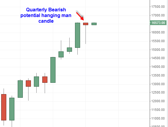 DJIA Quarterly Hanging Man
First, regarding the DJIA, I want to point out on the longer term chart that the DJIA has what looks to me like the most bearish looking potential hanging man candlestick on the quarterly price chart. It has a very long bottoming tail, and a small candle body. This is obviously a very long term potential candlestick reversal signal, and it is not confirmed bearish until a quarterly close under 15,340 occurs on the quarterly price chart. That feat actually does not seem too difficult given the typically weak seasonal time frame that includes the next 6 months, or two quarters. By the way, I should also mention that quarterly hanging man candlesticks marked the major tops in the sp500 in the year 2000 and 2007. Perhaps it is no coincidence that we are seeing yet another hanging man candle mark what could be another major top here in 2014.
 sp500 busted pattern setup 2014
The sp500 sell off today has changed the interpretation on the recent upside ‘breakout’. Instead of the breakout being confirmed, it has now changed into a failed breakout and is opening the door to a ‘busted pattern’ setup. The busted pattern I am referring to is the breakout north from the symmetrical triangle formation in the sp500. The low today on the sp500 (as of this writing) is 1863.26. This level comes close to the apex of the triangle formation it just broke out of. It is not that uncommon for a stock or index to come back to the apex of a symmetrical triangle formation to test the breakout level. However, a new bearish signal is given if price breaks under the apex support and then under the bottom boundary of the symmetrical triangle. Based on everything I am looking at this busted pattern setup in the sp500 will give a bearish signal in the coming days.
The Nasdaq has definitely been the weaker dog of the USA market indices recently. I am looking for the Nasdaq to move down into the nice even round number of 4000 like a magnet in the coming days. There are two key swing lows near the 4000 range in the Nasdaq Composite and I suspect they will be briefly taken out (the stops taken out) and then some type of swift multi day rally could occur setting up the B point of a B to C leg down.
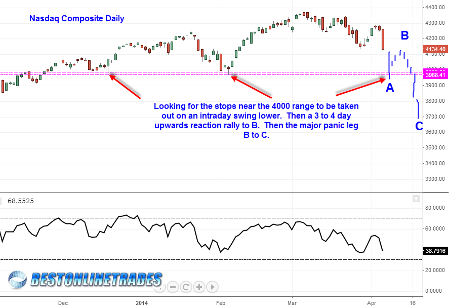 Nasdaq Composite Daily Break down scenario 2014
The thinking behind the scenario is that the Nasdaq is already close to a traditional oversold level and so it opens the door to some type of ‘flush’ intraday move down near or slightly below 4000 level (instilled panic). But then upon clearing out those stops, making a sharp 3 day spring board rally back up to the B point as indicated in the chart above. I would not be surprised at all to see the Nasdaq slide down intra day to slightly under 4000 and then end up closing near the high of the range by the end of the day.
The monthly chart shows that 4000 is also a key level of support and likely bounce zone:
 Nasdaq Composite Monthly 2014
The bearish gartley pattern that existed in the DIA ETF seems to have stopped the DJIA and is holding a lot more credibility now that we have seen the markets push off it with a big sign of weakness. The sp500 also had a small bearish butterfly and we see now as of today’s weakness that there was a strong reaction from the top of the pattern reversal zone. This seems to be suggesting that the reversal patterns are valid and that we should start to see an acceleration of weakness going into April 21st 2014.
Last but not least, I have mentioned a few times the similar pattern setup to the July 2011 time frame where we saw the sp500 attempt to make a new breakout high but then after it double topped, went straight down for almost 11 to 12 days straight. We are currently about 11 to 12 days away from April 21st 2014 and the pattern setup is similar to the July 2011 time frame. The RSI levels are also similar, so at the very least we can say that if such a persistent 11 to 12 day decline were to start from today onwards, there is plenty of ‘RSI fuel’ to keep the decline going from today forward.
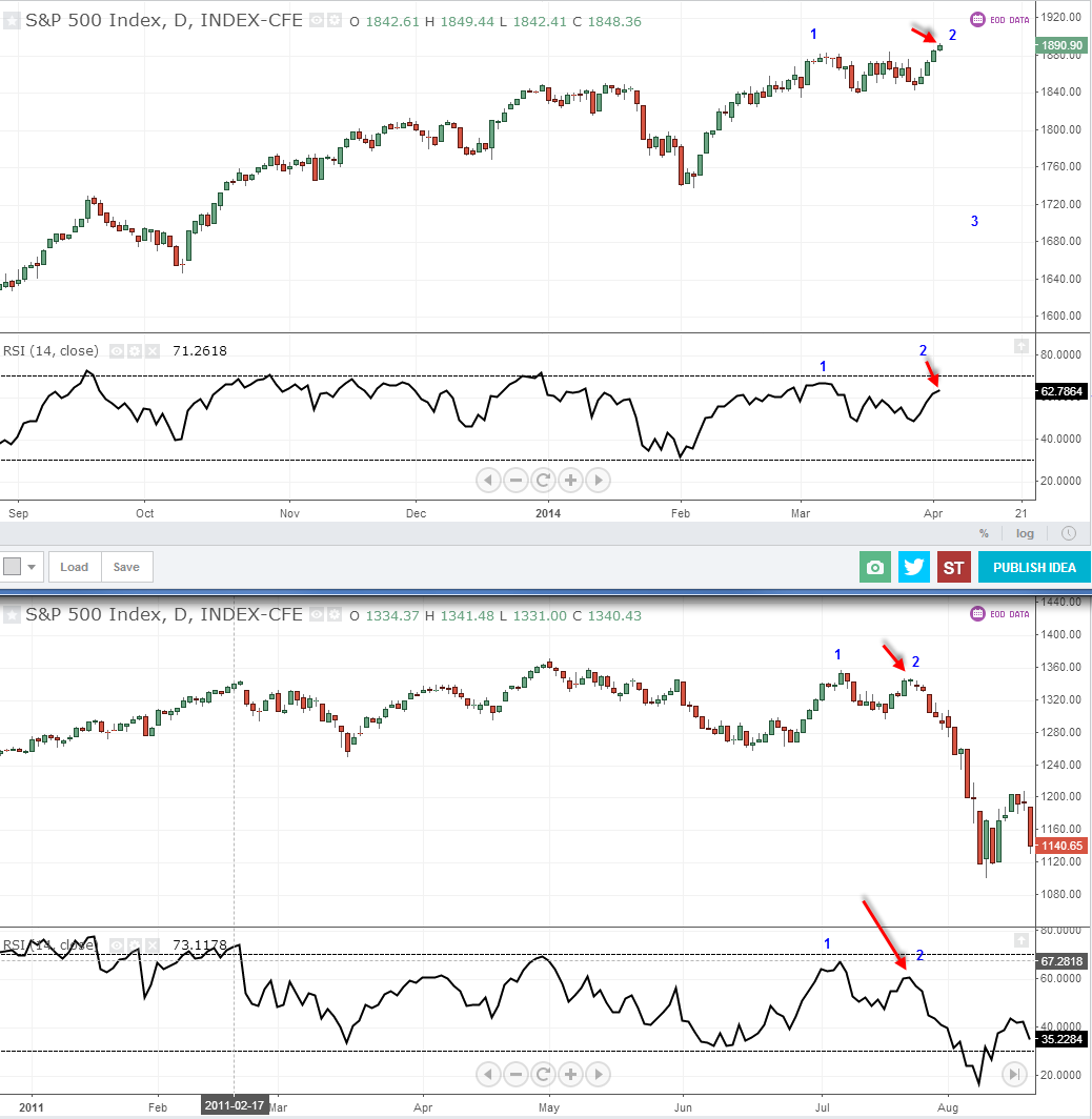 sp500 2014 to 2011 Comparison Chart