
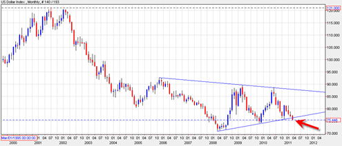
The US Dollar Index monthly candlestick chart shows that the US Dollar is breaking down south out of a huge consolidation pattern. I just have to look at this chart once to understand the potential implications.
The first potential implication is that the US dollar will eventually make a move to the 70 range. This has the potential to be bullish again for stocks and commodities.
A break down through this long consolidation pattern does not guarantee that it will continue in a new 5 to 10 year down trend, but it is possible. It is possible because we are dealing with a very large amount of sideways cause for a new move.
A false break down would occur if we see the US Dollar get down to the 70 range, then reverse and somehow manage to bust back inside this large triangle. I don’t expect the US Dollar index to do this, but it is a possibility to be aware of.
The issue is whether this break down in the US Dollar Index will lead US stock market and paper equities higher once again and substantially higher. I am open to this possibility. The ‘system’ wants to trash the dollar and get equities higher, simple as that. The ‘system’ also wants you to believe that they have everything under control and can change the rules at any time if need be. To a certain extent that is true. But when I look at this large price chart, I am thinking that they are too late already. They should have started to support the US Dollar strongly during the month of March 2011. But since they have not, the dollar is now at risk of a new acceleration DOWN.

This break down should cause commodities such as gold and silver to start to skyrocket again. I suspect it will also cause equities to make new 52 week highs again (sp500) but I am still studying the market index charts and need some more clarification this week.
It could be that the GDP number at the end of this week will be the ‘decider’ about more equity upside or a continuing correction.
There is an MACD Histogram buy signal right now in the SP500, but there is still confirmation of an upside break of the current bearish down trend in force. See today’s previous post to see the down trend line and the possible head and shoulders bottom.
The chart above of the US Dollar is quite scary looking although it may not at first appear so. I say it is scary because eventually it could mean the middle class of the US of A will become the new poverty class. But in the meantime the USA Stock market averages could continue to power higher creating the illusion that things are getting better and also helping to re elect the current president.
I can’t think of a single reason why the Dollar should go up. But technically, I definitely see a bounce coming up in the next few days.
Question: What country or foreign entity would want to buy treasuries, knowing when they mature and convert the $s back to their currencies they will book a substantial loss? Of course that substantial loss is compensated by the ZERO interest they earned in the treasuries!
And by the way the Federal Government depends on this type of investment to fund the government.
Trashing the dollar does not make sense.
Like I said before there is something here that really does not make sense.
What is going on here?
Question: Have I fallen down the rabbit hole.