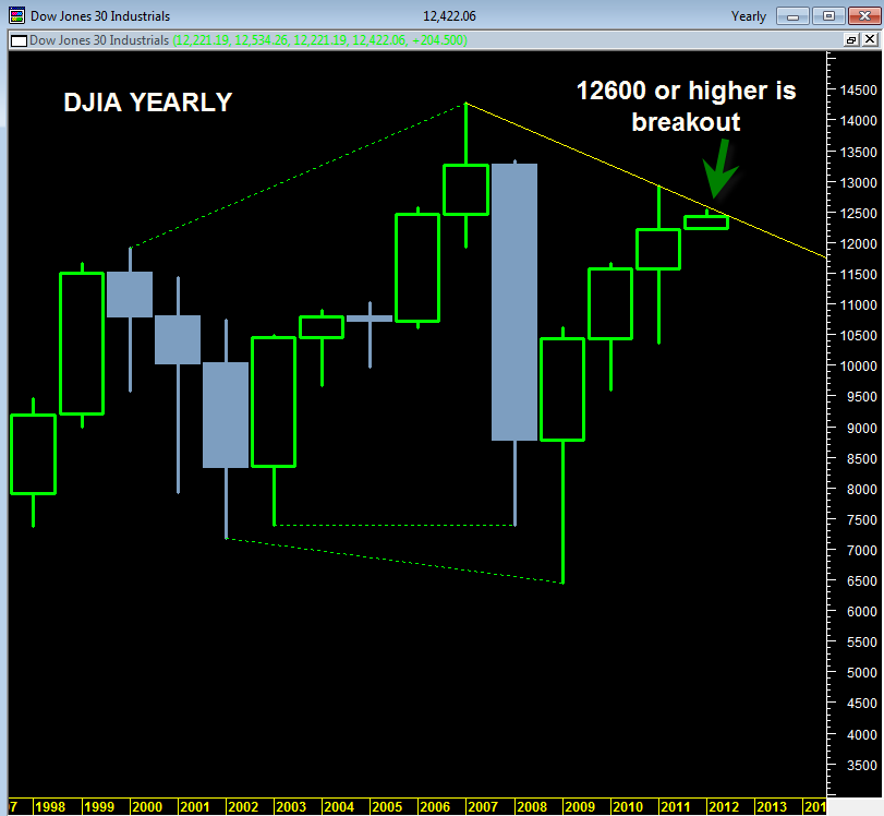
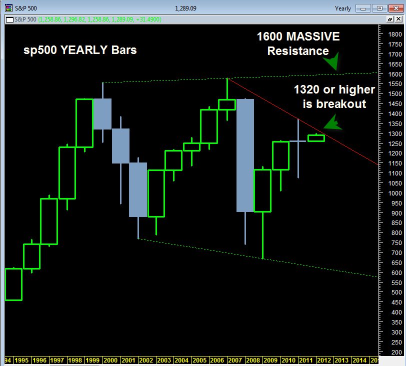
The stock markets as represented by the Dow Jones Industrial Average and the Standard and Poor’s 500 Index so far in 2012 have advanced higher but I would not call it a supercharged advance by any means.
The advance has been slow and steady on very light volume and downside price action has been slight. It is still very early in the year 2012 but already there is a trading dynamic seen from the YEARLY candlestick charts of the sp500 and DJIA that could be an important technical factor to watch as we head into February 2012.
Put simply, both the yearly DJIA price candlestick chart and the yearly sp500 candlestick price chart are showing that both are at key yearly resistance zones and they must soon decide whether they want to break out north from these resistance zones or reject them and turn back down again.
You can see from the above YEARLY price candlestick chart of the sp500 that it has been trading in a volatile range since the year 2000. The year 2000 peak and the year 2007 peak mark very important swing highs that define a green dotted resistance zone of a massive broadening wedge.
If the sp500 chooses the bullish option in the months ahead then 1600 could be where the sp500 wants to ultimately go before we see the next major trend shift (probably down).
But the major ‘if’ in this equation is if the sp500 in the next few weeks FAILS to hold and break above 1320. I would view a failure to break up and through 1320 within the next few weeks as a failure at the current yearly resistance down trend. That would likely mean price weakness into early 2012 that starts to ‘fill in’ price action from the previous 2011 long price candlestick.
The DJIA is at a similar juncture. The above chart is the YEARLY price candlestick chart for the Dow Jones industrial average. The DJIA needs to hold and break above 12600 for us to consider it having made a real upside breakout from yearly down trend resistance.
Similar to the sp500, a failure in the current range would likely mean swift downside price action under 12,000 and into the 2011 price candlestick.
Looking at the above two price charts without bias, it is difficult to say which way the market will decide to break. We could easily see a northward 2012 bullish breakout here, or a rejection and turn down again to make 2012 a down year.
The daily market internals are not flashing any huge warning signs at this time. The only one showing slight weakness is the bullish percent index. The summation index on both the NYSE and the Nasdaq are still strong.
For a first clue that the sp500 wants to start to turn bearish going into February 2012, look for the sp500 to close the month of January in the low 1260 range. That would create a bearish looking monthly candlestick similar to the April 2010 candle right before the May 2010 flash crash. It would also help bolster the argument that we are still creating a right shoulder of a massive head and shoulders topping pattern in the sp500.
The bullish clue that we are going much higher would be a break above 12600 in the DJIA and 1320 in the sp500.


