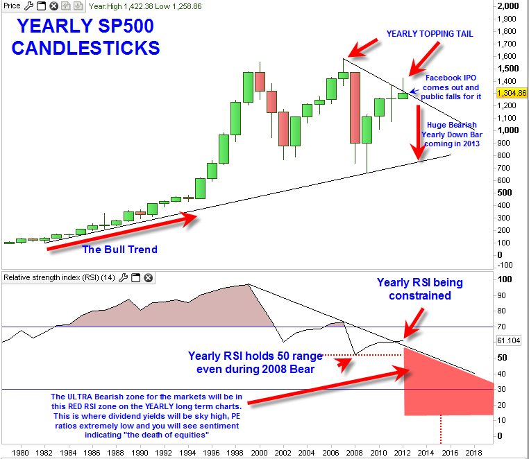
The updated yearly sp500 candlestick chart is showing that the 2012 price candlestick is morphing into a reversal candlestick and may morph even further into bearish form as the year progresses. The way the candlestick looks now (not even at the mid year point) suggests that there is a rejection of the new bull market zone above 1320. The topping tail on the current 2012 candle indicates supply came into the market in that range.
Of course the year is no where near finished and a lot can happen between now and end of year, but at least up to today it is taking a bearish form.
I suspect that the 2012 candlestick will continue to take shape of a bearish candlestick. If the 2012 candlestick is to remain as a bearish signaling candle very similar to the 2007 yearly price candlestick then it would suggest that the max downside for the 2012 candle will be in the 1210 range on the sp500.
So the scenario could play out with 1210 range being an important low and then an extended bounce into end of year period and then a new semi overbought stance in preparation for the real down move in 2012.

The yearly RSI structure shows that despite the long term bear market we are still technical in a positive bias era with RSI holding greater than 50. It will be a breaking of RSI under the 50 range that will invoke the ultra bearish most destructive consequences of this bear market. A yearly closing of RSI (relative strength index) under the 50 range will be the range where equities are truly hated. This red shaded sell off zone could become reality in the 2015 to 2020 time frame. That will likely be the time frame to load up on equities for ‘the long term’.
