
I was contemplating a little bit the MACD of the monthly inflation rate chart I posted a few days ago this past weekend and it occurred to me after reflecting on the yearly portion of that chart that we have not really even begun the commodity bull market. If you look carefully at the yearly MACD of the inflation rate chart in the link above it shows that the raging commodity cycle of the 1970’s did not really start until there was a yearly bullish crossover in the MACD of the inflation rate at that time. We are currently only just beginning a bullish yearly stance in the MACD crossover, likely to happen end of 2011 and into 2012.
The commodity up move in oil and gold so far appears to just have been a preview of what is to come. The yearly long term MACD inflation rate chart tells me that we are in for 10 to 15 year period of generally rising inflation and sometimes probably spiking higher inflation. This may not seem like new news, but the long term chart of the MACD of the inflation rate to me is new news and gives me something to sink my teeth into. But admittedly it is extremely long term.
A comment poster pointed out to me that the DJIA should be viewed in terms of gold to more accurately put into perspective the progress the market has made during the last decade and before that as well. It is a very good point and well worth repeating and keeping track of.
What has been interesting is that we have seen the DJIA continue to rise while gold has remained relatively flat lately. The more the DJIA continues to rise, the more it will require the gold price to move that much faster in order for the Dow to Gold ratio to hit the key 5.0 level. I figure that it will take a move in the gold price to the 2400 to 2600 range to get the ratio near 5 again. I view the 5.0 range as key channel support and a possible mid point stopping level for the gold bull run. So it appears we have a race going on and gold is winning hands down. The gold market is still not far from lifetime highs, and yet the DJIA despite its huge move has not even made it back up the top of the very long term swing trading range yet that began in the year 2000.
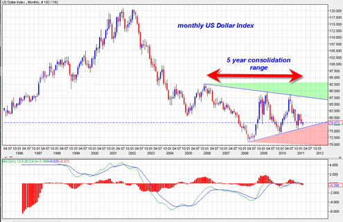
If we take a look at the long term US Dollar index chart we see that the US dollar index has essentially been consolidating in a very long (5 to 6 year) sideways trading range in the form of a very large symmetrical triangle.
The decision out of this very large triangle is going to be a very key event and a major signal on future moves in commodities and/or the equity markets.

The US dollar index is building massive long term cause. The previous move from 2001 to 2008 was one of extreme weakness. We could presume that the follow on move out of this triangle will also be weakness but it is much too early to tell. This long consolidation could either break out up or down. We see three touches at the top boundary line and three touches at the bottom boundary line.
For now my take is that it will eventually break down and through the bottom support of this triangle leading to much higher inflation and sky rocketing gold price. Indeed, in my opinion a break down out of this triangle will be the beginning of a truly sad state of affairs for the USA.
The monthly MACD on the US dollar index is currently in bearish mode.
One cannot rule out another move back to the top of the triangle again and we must also keep in mind the mid June 2011 Marty Armstrong cycle date for more clues.
Best Online Trades will be keeping track of the long term US Dollar index chart above and point out when something truly significant happens.
Final conclusion?
Overweighting commodities, commodity ETFS, mining stocks, for the next 10 to 15 years as a hedge against gradually rising and then accelerating inflation. They will likely be the best long term trade going forward and will probably eventually completely decouple from the dependency on rising ‘regular equity markets’.
This is very interesting because Gan Global thinks 60 year commodity bull cycle has ended.
http://www.gannglobal.com/webinar/2011/01/20-video-07.php
Look at the video and let me know what you think.
Thanks
Thanks for your comment. I watched most of the video. He could be correct. I know that Larry Pesavento also indicated that some very large fibonnaci patterns were being complete in the gold market on a very long term basis. There also appears to be the presence of the ‘three drives to a top’ pattern in the gold and silver price several months ago.
My sense is that Silver will not top out until it gets up to its old high of about 50 dollars that was achieve in 1980.
I looked at the XAU mining stock index and there is the appearance of a head and shoulders topping pattern. If the pattern is valid then we should really not be able to exceed 210 in the weeks ahead and should start to roll down again soon. That would be a potential important topping pattern and would open the door to the XAU failing its retest of the very long 3 year inverse head and shoulders.
But for now it is still an open question and we need more price data.
The SLV has recently blasted back up to near the 30 level and near the 52 week high. If SLV busts above 30 in the weeks ahead then the person referenced in your video link is probably wrong in my opinion.
So it seems correct to say that we are at a crucial juncture in both the XAU And the SLV ETF.
Depending on what happens in the days weeks ahead, I will write a post about it and reference your comment and video and get into more discussion on it.
Thanks for pointing it out.
One more thought. The US Dollar Index Chart I show in the posting above
http://www.bestonlinetrades.com/wp-content/uploads/2011/02/usdollar20110207.png
seems to fit in either very well with what he is saying or very poorly.
The US Dollar index chart is preparing for a huge move out of that 6 year triangle. If it busts UP then that would seem to confirm his theory and smash all the commodities down.
But if it busts DOWN, then it would seem to support more upside for commodities…
Place your bets!
But the US Dollar index chart above is a very slow moving chart and a very longer term signal based on its large structure.
Finally, this chart taken from his video seems to show that he is wrong at least on the CRB index.
http://www.flickr.com/photos/46088927@N00/5432555054/
The annotated chart I have drawn shows that the CRB broke out above the 2008 high and then did a classic RETEST and then resumed its upward trend. This is classic price action.
I would only view a top making process as valid IF we break and close back under 610 on the CRB continuous commodity index. Until that happens, the commodities bull is still alive in my opinion. Right now it is trading at 659.