
Sometimes you have to stare at your price charts a little bit longer to understand the real potential magnitude of what you are dealing with. Sometimes hidden clues in the charts only make themselves known until extensive contemplation and study.
BestOnlineTrades continues to push the limits of proper interpretation of these markets and we continue to focus on interpreting price action across multiple time frames. Only those who are able to interpret the price action properly across multiple time frames stand the best chance at understanding future market direction.
I was recently reviewing the monthly candlestick chart on the sp500 and it seems pretty clear to me now that the March 2011 monthly price candlestick is ‘potentially’ the most bearish monthly hanging man candlestick we have seen since in 41 years on the sp500. My chart data on the sp500 only goes back 41 years, so there could be a monthly hanging man that looks just as bearish as the March 2011 candle, but at least going back to 1970 I have not seen any with as much bearish potential as this one. In other words I have not seen in 41 years a monthly hanging man with such a LONG bottoming tail and a clean body with almost no top candle wick on it.
This monthly March 2011 hanging man candlestick is potentially very bearish because it has all of the perfect elements that make for a potent hanging man candle.
- It has a very long bottoming tail, huge.
- It has a very small real body and the body is red, or negative close
- It has a very small upper shadow.
- The open is very close to the closing price, almost making it a doji hanging man, or rickshaw man candlestick.
- It has formed after an almost straight up rally of 5 to 6 months duration.
Hanging man candlesticks are essentially hammer candlesticks that form after extensive price advances. They have the appearance of a bullish signal, but it is potentially the exact opposite.
They still do need to be confirmed however. The potential bearishness comes in as follows: Since the open is very close to the close, you have a situation where a lot of the buyers are either in at the open or at the close.
But then if the next candlestick opens down or QUICKLY engulfs the body of the hanging man candlestick, then all those who piled in at the open and close are left ‘hanging’ so to speak.
This can cause more rapid selling once they realize how ‘trapped’ they are near the highs.
The rising wedge formation that formed from mid March 2011 up to the present is consistent with a market that can fall quickly and so would support the case of trapping the buyers on close of the March 2011 hanging man candlestick.
I have seen some hanging man candlesticks in the past get retraced DOWN very rapidly in some cases because of this psychological dynamic, thereby trapping or hanging the complacent holders near the highs.
It is also important to recognize that this is a MONTHLY March 2011 hanging man candlestick which has larger time and trend implications than daily or weekly hanging man candlesticks. In other words, if this monthly bearish hanging man confirms, then it could mean bearish price action for several months at a minimum.

The monthly chart above clearly shows the long tail on the monthly hanging man candlestick for March 2011.
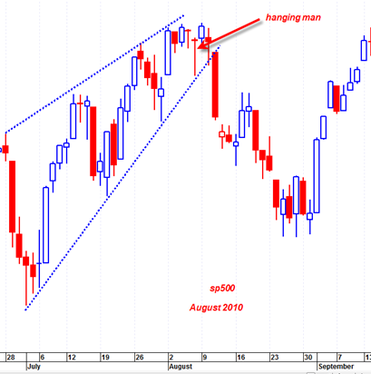
If you want to see a similar hanging man candlestick on the daily time frame just zoom in on the daily price action of August 2010.

That hanging man in August 2010 led to an important price decline in the sp500. This daily hanging man looks quite similar to the current March 2011 hanging man candlestick.
So by first appearances, the two charts above seem to be pointing toward a good amount of bearish action in the next few weeks.. Let us see if the market can confirm it properly…
Tom, that is great analysis and thanks for bringing that to our attention.
Please explain what is “confirmation” of this candlestick from your standpoint.
Tom, I calculated the swing from low of last month’s candle to the high of this month’s candle, and then applied Feb .38 to it to arrive at the first Fib level below the high:
March Low: 1249.05
April High: 1339.46
.38 Fib Support: 1305.1042
So this number, which is not far, NEEDS to hold. We are very close to it.
This could be one type of confirmation of breakdown, using Fib analysis.
Take a look at OIH Monthly. Confirming. Same for XLE.
XLB has a topping tail in addition for current month. Probably multiple month high.
Interestingly XLV and XLP have not confirmed and are continuing higher. So it is not bad news on all sectors.
confirmation that this massive monthly hanging man is bearish would be a monthly price closing below the low of the March 2011 monthly candlestick…
interesting that 1305 is fib support… makes sense given support range…
I have a feeling things are going to get quite ugly in the next few weeks but market has to start declining on more volume as hint it wants to get to 1250 again..
The SP500 mothly analysis is impressive, but depends very heavily on the artificial construct of the calendar months. If instead of looking at the actual calendar months, you looked at charts depicting a rolling 30 day time interval you’d see the hanging man pattern swell and decay and even disappear for various choices of start dates. From that perspective it seems a little silly to fuss overly on the implications of a calendar month chart.
Thanks for the comment Buddy.
You make a good point.
But I think most people who follow markets use a standard calendar to make decisions on prices, and do not start their months offset by any factor. I am simply following the ‘herd’ so to speak.
But I think even if I were to make the chart on 30 day periods that start at the middle of this month, it would probably still show a bearish candlestick setup since the price movement over time is reflective of degree of sustained buying or selling and volume.
If you look at the monthly chart from 2009 on up you will see several bearish candlesticks formations that would seem to have foretold of a reversal in the market, only to end up as a temporary rest stop for a manic market. We must not forget the most important overriding force in the market is QE2 which will continue through June.
At that point Bernake may withdraw it temporarily to see if the economy can continue to grow without it. He may just remove it to show critics how much we need it so they will stop bitching about it and learn to love and embrace it as he mercifully reinstates it to “save” us once again
Of course at that point, we will then know for sure that we are all totally screwed and there will be no way back from this train wreck