
The yearly candlestick chart of the sp500 is indeed one of the most powerful technical analysis charts in the current multi decade time frame. The yearly time frame is the maximum time frame in technical analysis and identifies massive bull or bear markets and massive support and resistance levels.
What we can see from the current yearly sp500 candlestick chart is that the sp500 has been trading in a massive trading range since the year 2000. Before the year 2000 was a raging bull market in equities, a slow and normal trending market. That was the mega bull future generations will look at in total awe.
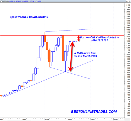
But since 2000 the market has been in a highly volatile trading range state. We see now that the sp500 has been trading the last 3 years (including this year) in an upward recovery trajectory.
For longer term purposes I think it is very prudent to look at the context of the sp500 now within this large trading range. The fact is that since the March 2009 low of 666 in the sp500 the sp500 has traded higher until today on the order of 100%. That is a huge move.
The percentage move from the LOW of 2009 to the HIGH of 2009 was about 70%. The percentage move from the LOW of 2010 to the HIGH of 2010 was about 25%.
Currently the LOW of 2011 is 1249. A move to 1470 would be about 17.5%. But a move from the current level of today to 1470 is only about 10%.
So what this is basically saying to me is that the FAT of this recovery move has been accomplished. The trade was at the 666 low. And we have already had 100% upside. Now there only appears to be about 10% upside left if we assume that market will get stopped at 1470. But 1470 may only be a pause point for an eventual blast higher (temporarily) into the 1500 range up to 1593.

Why do I say only 10% upside left? Because the 1470 level on the sp500 is extremely strong resistance going back a whole decade. This is the level where the market has either opened or closed on a YEARLY closing basis going back to the year 2000.
The sp500 does not have to stop in its tracks assuming it gets to 1470, but in my opinion it is a very important potential stoppage point. Any price action that is trading above 1470 needs to be handled very carefully in my opinion because it could simply be ‘overthrow’ that will eventually be rejected strongly at the top solid blue broadening wedge boundary line as seen in the chart above.
The solid blue lines that have touched the extreme low and highs points in the chart above appear to define a very large broadening wedge formation. We see that the 2003 recovery rally lasted 5 years. We are currently in year 3. If we assume that we can recover for 2 more years to the upside, then it would possibly open the door to an eventual retest of the top of this very large broadening wedge formation.
That could set up 1593 as the next great shorting opportunity of a lifetime in 2013.
This long term trading dynamic of the sp500 seems to fit quite nicely with the next election cycle. If we assume that Obama will win the next election in November 2012, then it makes sense for the market to power higher into this election. So that represents about 1.5 years of trading time.
So then assuming he wins, it would then in effect make him a ‘lame duck’ president for the following year(s). So we could see a further surge higher in the sp500 ABOVE 1470 during this initial new term of President Obama (assuming he wins). This initial surge may take the sp500 up to 1593, right at the TOP OF THE VERY LARGE BROADENING WEDGE FORMATION.
And then?
The bottom falls out of the market from there on a lame duck presidency that is plagued by horrible inflation…
How is that for a scenario. I hope someone comments on this post as we near some of the future important dates shown above.
I think it is an interesting scenario with respect to the motivations of the election cycle…
P.S. Study the above yearly chart of the sp500 very carefully. It is likely telling us many important secrets. Note the order of the price action. Peak in year 2000, then a violent decline into an important low of 2003. Then a huge surge up again back to a SLIGHTLY HIGHER HIGH in 2007…. then a total collapse DOWN to a SLIGHTLY LOWER LOW in 2009…
And now another huge surge up… and if the pattern repeats and is consistent with the broadening wedge formations, the sp500 will once again take us to a SLIGHTLY HIGHER HIGH as compared to the 2007 period. I am theorizing that this new higher high level will be near 1593.
The broadening wedge formation is a very frustrating pattern in that it tricks one into believe that a major new trend is in force when instead they are simply major rallies or declines within the overall pattern.
P.P.S In fact you know what I am going to do ? I am going to set up an email reminder in my google calendar to send me an email at the end of 2011, 2012 and 2013 to review this posting and this chart and some of the theories I am suggesting here. I can’t wait to find out the results! (but alas, it will be a long long wait…)
Given how far the markets have come, makes me think that 1470ish is a given. Such lines have powerful influence of pulling the index up. Putting this in perspective, the next 10% in the market index (that’s 25-30% in a 3x leveraged instrument) is much lower risk than it would seem to be.
That is a good point with regard to leveraged ETFS and another 10% of upside. I am just relying on the standard definition that a very mature trend is more technically risky than a very early developing trend.
All I have to say is there are no (or rarely) triple tops